DIY Animated Video Platform
Turning a complex animation tool into a intuitive experience for first-time users and supporting growing product complexity.
🎯 Overview
As Vyond transitioned away from legacy technology, we seized the opportunity to rethink the product’s foundation — starting with the information architecture. The redesign wasn’t just visual; it was structural.
By first redefining how content and workflows were organized, we laid the groundwork for more scalable, consistent, and user-centered experiences across Vyond’s two core products:
- The Studio – for creating animated videos
- The Character Creator – for building customizable characters
Role
Senior UX Designer
Team
Design team & eng team, product owner.
Information architecture Design Systems Cross-functional Collaboration2014 - 2018
🔍 Background & Context
I joined Vyond in the Hong Kong office in the early days when the company was at an turning point, approaching product-market fit. Our team was lean — 3 designers among approx. 30 employees. We were deeply hands-on and cross-functional, working closely with colleagues in Taiwan and San Francisco.
During this period, I helped lay the groundwork for scalable product design as the company doubled in size annually. Some key contributions included:
- Establishing a design process: We moved from ad-hoc design to structured workflows, improving alignment between product, design, and engineering.
- Improving usability: Regular user testing uncovered friction points, informed iteration, and helped nurture a more user-centric culture across departments.
- User onboarding: We mapped user journeys to streamline onboarding, reducing churn and increasing feature adoption.
- Pattern consistency: I designed and documented reusable interaction patterns, ensuring cohesive experiences and faster handoffs.
🔧 Process & Approach
We applied a Double Diamond framework to move from ambiguity to clarity:
1. Discover: Research & Audits
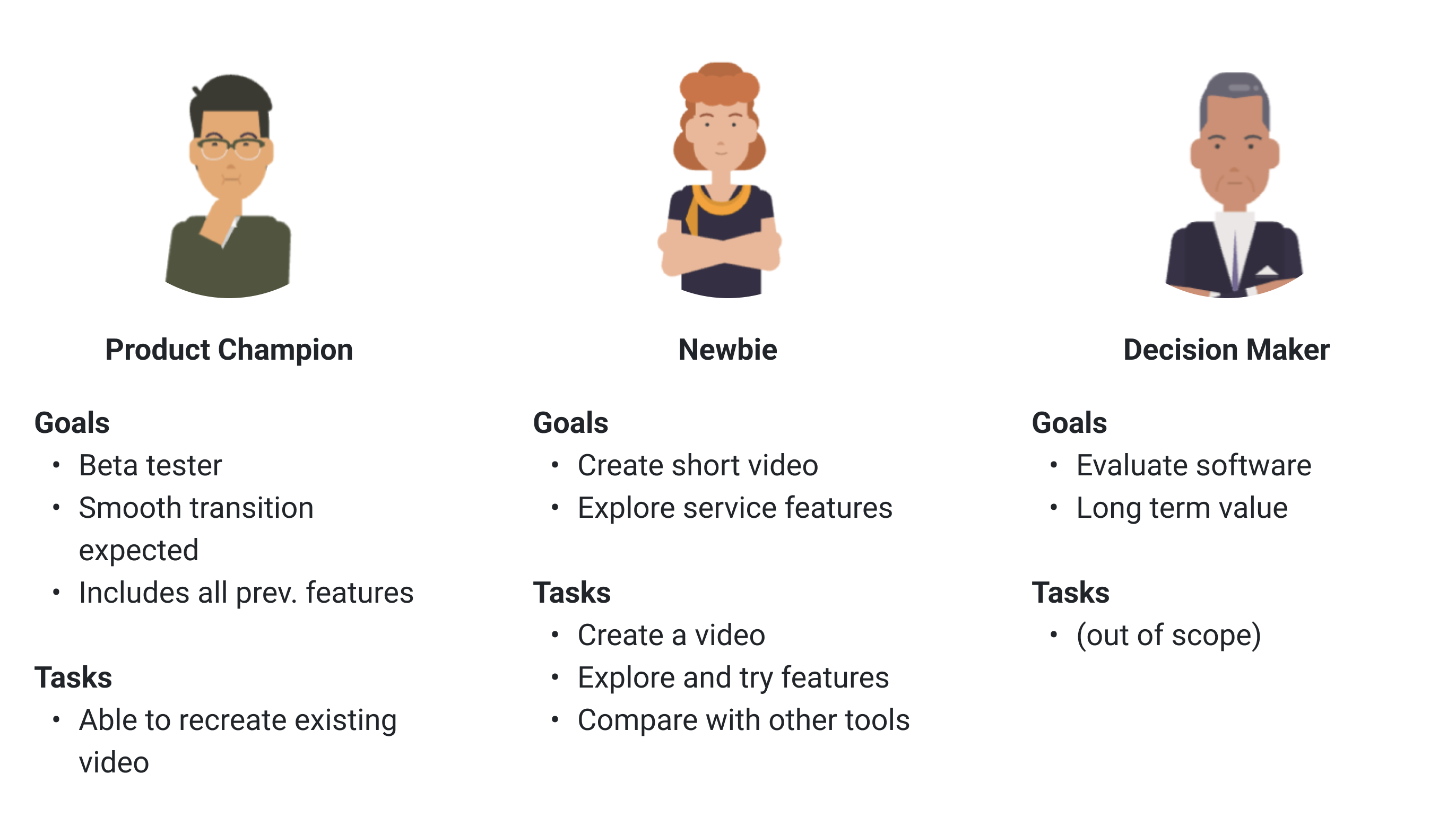
- Identified three key user personas (see below) with distinct goals and tasks to prioritize usability improvements and define content structure.
- Conducted user interviews and usability tests, uncovering critical navigation pain points.
- Ran a content audit to map relationships between assets, components, and screens, identifying redundancies and opportunities.
2. Define: Problem Framing
As the app’s complexity grew, so did its usability challenges:
- Fragmented navigation made content discovery difficult.
- Inconsistent structures across tools and panels slowed experienced users and overwhelmed new ones.
- Designers were shipping features without considering the global IA, making scalability difficult.
3. Develop: Systemic Pattern Design
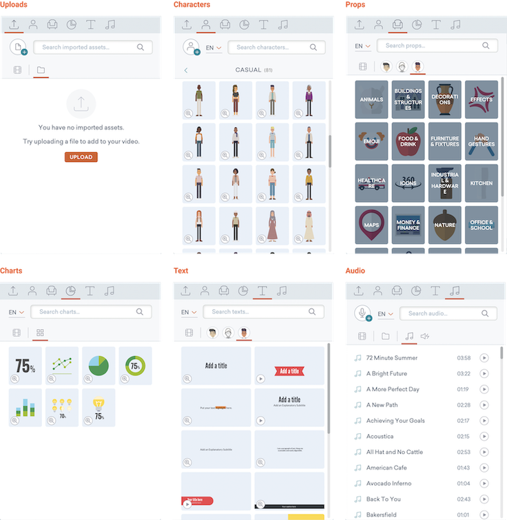
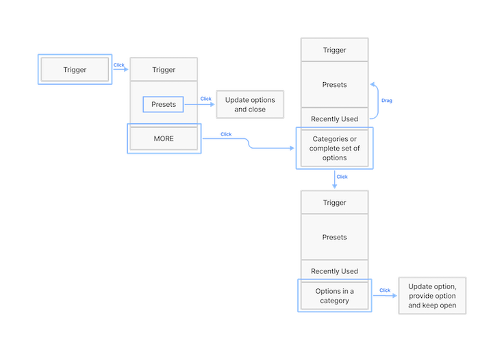
- I created a modular interaction design pattern to unify navigation and asset management.
- The system scaled across user types — from beginners to power users — and supported the needs of both creators and managers.
- These patterns were documented and shared across teams to support parallel development and maintain consistency.
4. Deliver: Testing & Validation
With the updated pattern, we conducted further user tests, which showed increased task completion rates. We shared results in cross-functional reviews to build support and encourage reuse across teams.
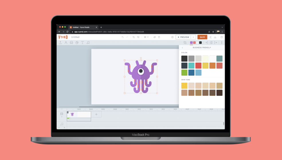
📹 Example: Pattern in Action (26s)
Design pattern in action, demonstrating how users browse, apply, save, and reuse colors.
💬 Reflections
One of the toughest challenges was advocating for architectural change late in the development cycle. Rethinking structure mid-cycle isn’t glamorous — but aligning stakeholders and tightening constraints gave the team breathing room to solve real user problems. But that shift ultimately helped the team work with clearer constraints and freeing up time to work on deeper user problems.